Shade planning · 6 min
Preview blonde, brunette, copper, burgundy, and custom hair colors
Published August 3, 2026
A photo preview is strongest as a comparison tool. Instead of asking it for the one “correct” color, use it to compare warm and cool directions, lighter and deeper impressions, natural and bold choices, and the strength of the effect.
Begin with broad color families
Start with a few visibly different families: blonde, brunette, copper or auburn, burgundy, silver, and a bold option. Broad comparisons reveal preference faster than moving through many nearby swatches. Once a family feels promising, compare the closer choices within it.
Keep Compare available so the original remains the anchor. The app changes the selected hair color while preserving the photo’s pose, crop, visible texture, and light. That makes it easier to judge the direction against the same face, clothing, and setting.
Blonde previews: judge warmth before brightness
A blonde preview can help distinguish a warmer honey or golden direction from a cooler, ashier impression. It cannot prove that the current hair can reach that lightness safely or in one appointment. Dark or previously colored hair may require lightening, and the visible outcome depends on the underlying pigment and condition.
If the preview seems flat, lower the intensity so more of the original shadow and variation remains visible. Use a clear source photo with highlights that already describe the hair’s shape.

Brunette previews: compare depth and temperature
Brunette is not one color. A preview can help compare a neutral brown, a warmer chestnut direction, or a deeper espresso impression. Pay attention to whether the darker choice still leaves separation between sections of hair. If the photo’s shadows collapse into one shape, reduce intensity or select a slightly lighter shade.
Copper and auburn: watch the existing light
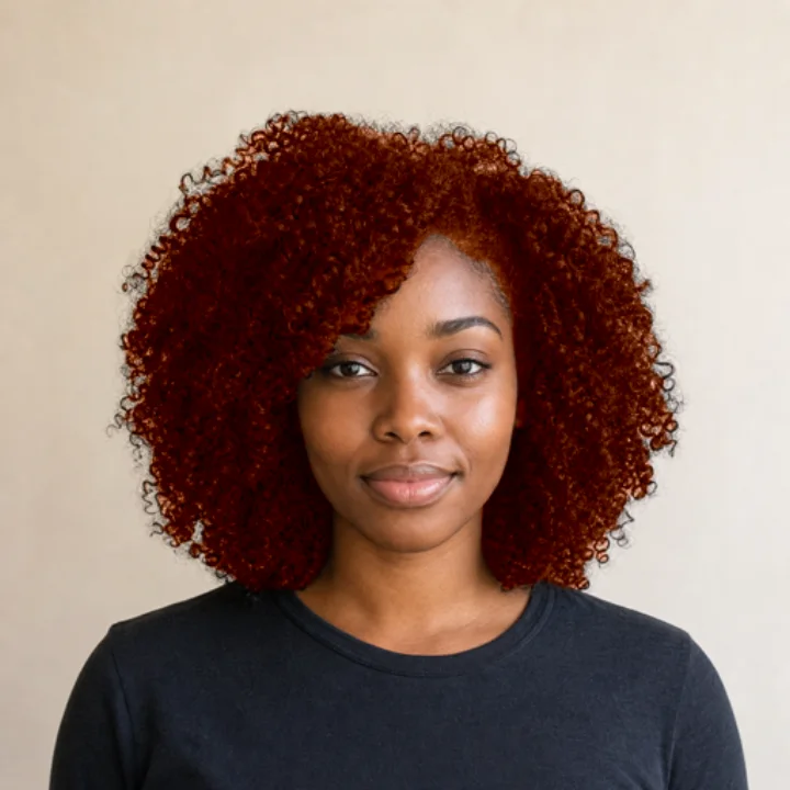
Copper, auburn, and red-brown directions respond strongly to the warmth already present in the photograph. Indoor tungsten lighting can make a copper preview appear warmer than it would in daylight. Compare the same finalist in a second photo before treating that warmth as a stable preference.
Burgundy and bold colors: use intensity deliberately
Burgundy, pink, blue, rose gold, and other bold colors are clearly interpretive. A high-intensity preview makes the hue easy to see; a lower setting can show how the direction relates to the source color and lighting. If the source hair is very dark, a vivid preview still does not mean the result is possible without lightening.
Custom color: useful when you already have a target
The custom picker is most useful after the broad decision. If you have a reference swatch or a specific warm-versus-cool target, use the grid, spectrum, or sliders to move toward it. Do not expect a screen color value to transfer directly into a dye formula. Displays, photo white balance, ambient light, and hair chemistry all use color differently.
Use a simple comparison method
- Choose four broad families.
- Eliminate two after checking them against the original.
- Try two related shades in each remaining family.
- Adjust intensity only after choosing the finalist shades.
- Repeat the finalists on a second photo in different lighting.
This keeps the process from becoming an endless swatch carousel. The goal is a small set of directions worth investigating, not a false promise of certainty.
The app can show how a color direction looks in a particular photograph. Product instructions or a qualified colorist should answer whether the hair can reach it, what preparation is required, and how the result should be maintained.